Color Trends 2026: Three Production-Ready Palettes
In 2026, colour is no longer just aesthetic, it’s operational. Design teams are embracing high-impact neon blends and grounded, tactile earth tones. But as palettes become more sophisticated, the risk of production error increases. Slight colour shifts, incorrect profiles, or ink overload can turn a profitable job into a costly reprint.
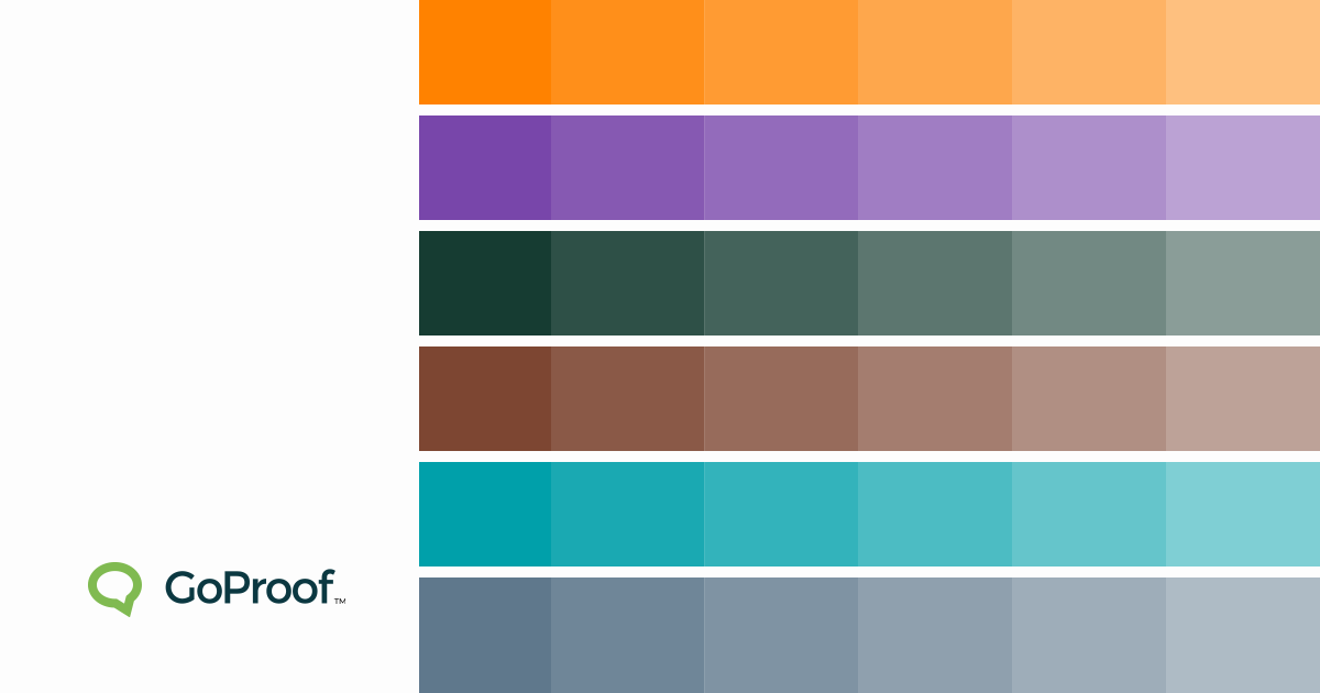
Below are three defining palettes for 2026, complete with practical colour references and guidance for print-ready execution.
Palette 1: Synthetic Sunset
A bold, digitally amplified palette inspired by smart cities and immersive interfaces.
Liquid Amber
Pantone (approx.): 1505 C
CMYK: 0 / 65 / 100 / 0
RGB: 255 / 130 / 0
Hex: #FF8200
Cyber Violet
Pantone (approx.): 2665 C
CMYK: 72 / 88 / 0 / 0
RGB: 120 / 70 / 170
Hex: #7846AA
Production Risk
High-saturation tones often exceed standard CMYK gamut. Neon-like effects seen on OLED screens can flatten significantly in print.
Pre-Press Considerations
Convert RGB early and compare against Pantone equivalents.
Check total ink coverage to avoid drying and offset issues.
Use automated preflighting to flag colour profile mismatches.
Palette 2: Organic Rawness
A grounded palette reflecting sustainability, authenticity and tactile materials.
Kelp Forest
Pantone (approx.): 5535 C
CMYK: 85 / 30 / 60 / 70
RGB: 22 / 60 / 50
Hex: #163C32
Smoked Clay
Pantone (approx.): 7596 C
CMYK: 35 / 70 / 80 / 40
RGB: 125 / 70 / 50
Hex: #7D4632
Production Risk
Muted greens and browns are highly sensitive to:
Paper stock warmth
Coated vs uncoated shifts
Lighting conditions during sign-off
These tones often look dramatically different under press lighting versus office environments.
Pre-Press Considerations
Always soft-proof on calibrated monitors.
Compare coated vs uncoated Pantone references.
Lock colour profiles in your final press-ready PDF.
Palette 3: Digital Mineral
A cooler counterbalance to neon warmth, combining AI-inspired blues with mineral greys.
Electric Teal
Pantone (approx.): 7711 C
CMYK: 80 / 10 / 35 / 0
RGB: 0 / 160 / 170
Hex: #00A0AA
Mineral Blue
Pantone (approx.): 5405 C
CMYK: 60 / 35 / 25 / 5
RGB: 95 / 120 / 140
Hex: #5F788C
Production Risk
Cool palettes often suffer from:
Cyan dominance shifts
Grey banding in gradients
Transparency flattening errors
These are especially common in large-format packaging and publication spreads.
Pre-Press Considerations
Flatten transparencies correctly in exported PDFs.
Monitor ink limits to prevent over-saturation.
Run automated checks for embedded ICC profiles.
Print Errors Destroy Margins
Physical reprints cost two to three times the original job margin. They:
Waste substrate and ink
Consume valuable press time
Delay downstream fulfilment
Erode client trust
One missed colour profile can turn a profitable packaging run into a loss.
Zero-Error Printing Starts Before the Press
Press operators cannot fix file preparation issues on the fly.
Zero-error workflows include:
Correct press-ready PDF settings
Early print quality control
Automated preflighting
Colour profile validation
Ink coverage checks
Common preventable issues:
Colour shifts from RGB files
Font reflow
Transparency errors
Ink overload
Final Proofing Protects Profit and Productivity
The final approval stage is where most margin loss occurs.
Centralised proofing enables:
Simultaneous sign-off from Marketing and Production
The biggest colour trends for 2026 centre around digital realism, combining neon-inspired high-saturation shades like amber and violet with muted, earthy tones such as deep greens and clay browns.
How can I ensure colour accuracy from screen to print?
Use calibrated monitors, defined colour profiles (CMYK or spot colours), Pantone references, and online proofing software that flags profile mismatches before files reach production.
What tools can I use to create colour palettes for 2026 designs?
Popular tools include Adobe Color, Pantone Connect, Coolors, Colormind, Figma community resources, and Canva’s palette generator.
By clicking “Accept”, you agree to the storing of cookies on your device to enhance site navigation, analyze site usage, and assist in our marketing efforts. View our Privacy Policy for more information. Update your Cookie Preferences.