

Balance creates stability in a layout. Symmetrical balance puts elements evenly across a center line to create a formal look. This style works well for reports or official papers that need to look serious. Asymmetrical balance uses different visual weights to create interest while keeping the page steady. A large photo on one side can balance a block of text on the other. This method feels modern and moves the eye across the page. Designers place weight carefully to stop the layout from feeling messy or heavy.
Contrast pulls attention to specific parts of a page. It separates important facts from small details. High contrast makes reading easier by putting light text on dark backgrounds or bold titles next to thin text. Choice of color is important here. Using opposite colors or different shades creates depth. Contrast stops a design from looking flat. It makes the viewer see key messages right away. Without contrast, the audience might miss the main message or a safety warning.
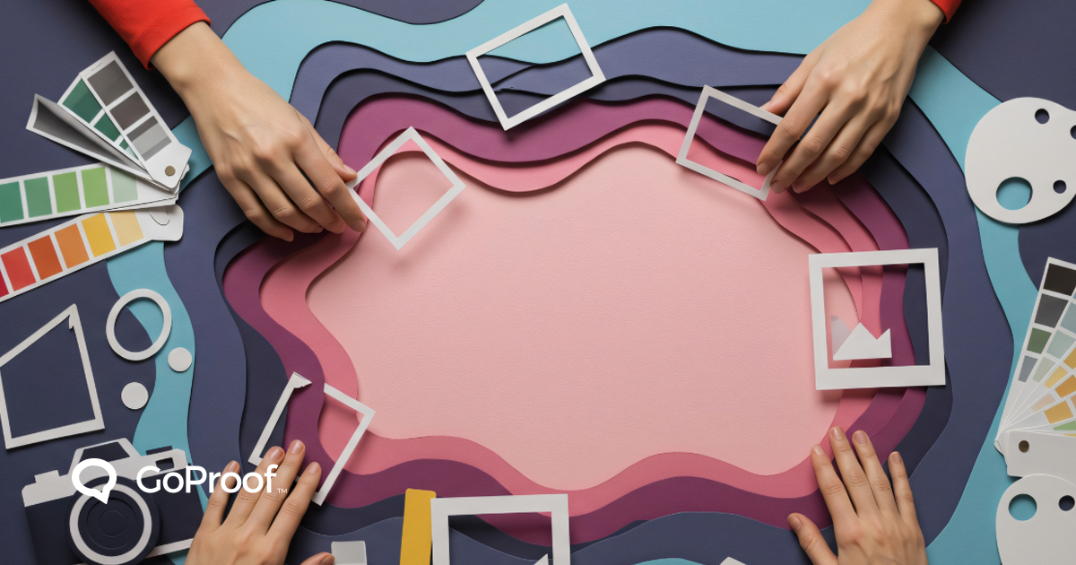
Emphasis creates a focal point. Every print project needs one main part that catches the eye first. Size is the fastest way to create emphasis. A large title or a main image shows importance. Location also matters. Putting an item in the center or at the top of a page gives it priority. Designers use emphasis to lead the viewer through the content. If every part has the same weight, nothing stands out. Good print layouts focus on one main idea and support it with smaller facts.
Hierarchy organizes information by importance. It acts as a map for the reader. Large titles sit at the top, followed by smaller headers and body text. Keeping font sizes the same across a long document maintains this order. Hierarchy ensures the reader follows the logical flow of information. For example, in a manual, step numbers must look bigger than the description. This setup helps the user find facts fast.
Alignment brings structure and order. Every part of a page should have a visual link to something else. Putting text and photos on a grid creates a clean, professional look. It shows that every choice is planned. Center alignment looks formal, while left alignment is best for reading long stories. Good alignment stops a layout from looking messy. It creates invisible lines that hold the design together.
Proximity groups related items. Putting a price near a product name or a caption near a photo makes the link clear. It turns the page into logical sections. Proximity removes visual clutter by creating clear blocks of information. When items are too far apart, the reader cannot connect them. When they are too close, the design feels tight. Finding the right space between groups makes the page easier to use.
Repetition builds brand recognition. Using the same fonts and colors on every page creates a solid identity. Repetition helps the audience know the brand fast. It also makes long documents easier to read. If every chapter in a book uses the same look, the reader knows where to find page numbers. Consistency shows professionalism and reliability.
White space gives the eyes a place to rest. This is the area on a page with no text or photos. White space stops a design from crowding the audience. It makes text easier to read and shows off the most important parts. High quality print design uses white space as a tool. It gives the content room to breathe and makes it look more inviting. Full designs often look cheap and hard to read.
Typography is the voice of the design. Picking the right font sets the mood. Some fonts look traditional, while others look clean and modern. Clear text is the most important part of print. Small words must stay sharp when printed on different paper. The space between letters and lines must be set for the best clarity.
Color accuracy is vital for the final product. Print uses CMYK, which stands for Cyan, Magenta, Yellow, and Black. This is different from the RGB colors on digital screens. Designers change files to CMYK so the final print matches the design. Colors often look darker on paper than they do on a bright monitor. Testing color samples stops surprises during the final print run.
Design elements in print templates include margins and bleeds. Margins provide a safe area so text does not get cut off during trimming. Bleeds extend the art past the edge so photos reach the very end of the paper. These technical rules are needed for a professional finish. Using a template with the right settings saves time and stops technical mistakes at the press.

Proofing design print is the final step in the work process. It means checking every detail before starting the full print run. Proofing confirms that balance and hierarchy work on the physical page. It checks technical facts like image quality and ink limits. High resolution photos are needed so the print stays sharp. Proofing is also the last chance to find typos or facts that could cause a costly mistake.
Following these rules ensures every print project reaches professional standards. Clear design leads to better communication and fewer mistakes. Good design focuses on the user while keeping the brand strong. By using balance, contrast, and hierarchy, designers create physical items that work well in a busy market.
Smarter Proofing. Faster Approvals. GoProof.


