

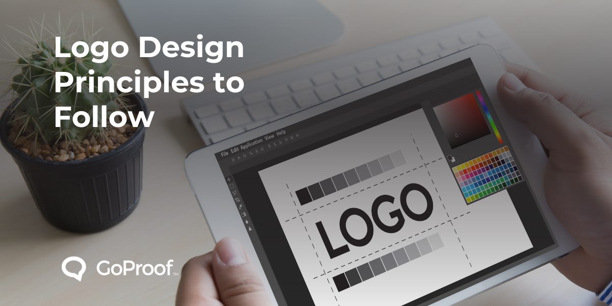
If you want to know how to make logo designs that work, start with these principles.
Simplicity
A simple logo is easy to recognize and remember. Avoid overly complex details or busy elements. Think about how a logo looks on a small phone screen or a billboard. The best logos are often the most simple.
Memorability
A logo should be distinctive enough to be memorable. It should leave a lasting impression on the viewer. A unique shape or a clever use of negative space can make a logo stick in the mind.
Versatility
A good logo works well in different sizes and formats. It should look good in black and white, and on various backgrounds. It must be scalable, from a tiny app icon to a large sign, without losing its clarity.
Timelessness
A successful logo does not chase trends. It should have a classic quality that ensures it remains relevant for years to come. Trends come and go, but a timeless design will endure.
Appropriateness
A logo must fit the brand it represents. The style, color, and typography should communicate the right message to the target audience. A logo for a children's toy company will look very different from a law firm's logo.
Here are some practical logo design tips to put these principles into practice.
Start with pen and paper
Sketching different logo design ideas first helps you explore many concepts before you move to digital tools.
Consider color psychology
Colors have strong associations and can affect how people perceive a brand. For example, blue often represents trust, while green can signify nature or growth. Choose a color palette that fits your brand's message.
Select typography with care
The font you choose is a key part of your logo. It should be legible and consistent with your brand's personality. Avoid using too many different fonts, as this can make the logo look cluttered.
Access free resources, to help with your next logo design project, via our Designer's Toolkit.
The design process is not complete until the logo is approved. Proofing for designs is a critical step that ensures the final product is perfect. This is where you catch any mistakes before the logo is published.
Proofing logo designs helps you verify every detail. You need to check for minor errors, like a stray line or a font kerning issue. You must also ensure the logo looks right in all its intended applications, from a website header to a business card.
Use a dedicated tool for proofing logo designs. It allows you to collect all feedback in one central location. This prevents confusing email threads and conflicting notes. With a clear audit trail of all comments and approvals, you can ensure everyone is on the same page and that the final version is correct. A solid proofing process protects the quality of your design.
Creating an effective logo requires a focus on key principles. By concentrating on simplicity, memorability, versatility, and appropriateness, you can design a logo that truly represents a brand. Following these logo principles and using a structured proofing for designs process ensures your final logo is successful.
Smarter Proofing. Faster Approvals. GoProof.


